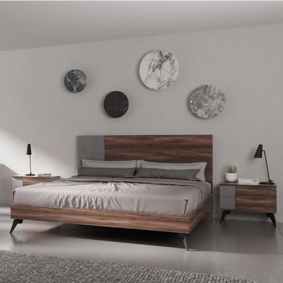
Displaying wall art is an art in itself. The right artwork, coupled with its strategic placement, can entirely transform a room's ambiance. Here's a comprehensive guide to effortlessly elevating your spaces with art.
1. Measure for Proportional Placement

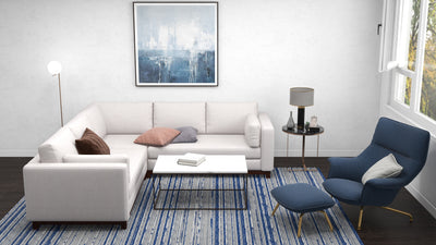
Golden Rule: Your selected wall art should be proportional, covering about two-thirds of the width of the furniture underneath. For clarity, if your wall space sits atop a nine-foot sofa, your artwork should ideally be around six feet in width.
2. Perfecting the Artwork Altitude

Universal Principle: Art is best appreciated at eye level. Given that eye level differs, it's safest to hang the artwork such that its center is approximately 60 inches off the floor. Also, allow a buffer of 4-6 inches between the base of your art and the furniture beneath, ensuring a harmonious visual flow.
3. Harmonizing Multiple Art Pieces
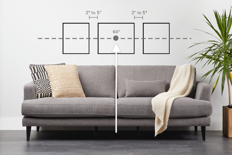
The Collective Approach: Think of multiple artworks as parts of a larger whole. Their combined width should respect the two-thirds rule, with the center aligning with the 60-inch guideline. To maintain aesthetic spacing, keep a steady 2-5 inch gap between individual pieces.
4. Creating a Dynamic Gallery Wall
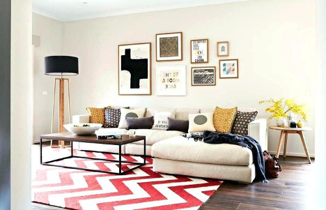
Maintaining Cohesion: While setting up a gallery wall, think of it as a solitary artwork piece. Adhere to the size and height norms. For a connected, immersive display, keep a closer spacing of 1-2 inches between each artwork. This closeness not only amplifies the gallery's charm but also allows for more artwork to be showcased.
5. Layering on Shelves with Precision
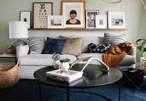
Shelf Showcase: If layered shelf displays appeal to you, the fundamental rules of wall art placement still stand. For solo shelves, position them 4-6 inches over the furniture. Artworks of diverse sizes can then be layered, with the primary piece's center aligning with the 60-inch guideline.
For two-tier shelves, the top shelf should start at the 60-inch mark. The bottom shelf should hover 4-6 inches over the furniture, with artworks of a relatively smaller scale due to the limited vertical space.
6. Balance for Collective Displays
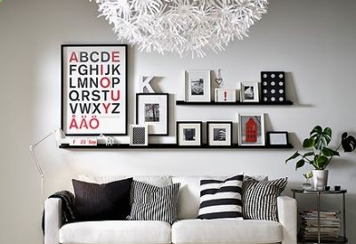
Ensemble Equilibrium: When arranging a collection, visualize it as a single artwork to attain balance. The collective artwork should neither dwarf nor be dwarfed by your furniture, following the two-thirds guideline. For multiple pieces, heavier artworks work best on the bottom left, lighter ones on the top right, with medium-sized pieces filling the gaps. An insider tip: Use low-tack tape to maintain consistent spacing.
7. Mastering the Salon-Style
Personalized Panache: Salon-style, with its mix of paintings, prints, photos, and sculptures, is endearing but can be daunting. The arrangement should resonate with personal preferences, but adhere to the spacing principles mentioned earlier. Use craft paper and low-tack tape for precise arrangement and nail placement.
8. Exploring Art Beyond Traditional Boundaries
Innovative Placement: Wall art doesn't have to be restricted solely to your walls. There's a realm of potential waiting to be explored! Consider using floating shelves as an alternative platform. These shelves provide the perfect stage to layer various artworks, enabling you to create a multidimensional visual appeal. This approach breaks the monotony and brings a contemporary flair to the space. Another avant-garde strategy is to prop up a larger-than-life art piece against a wall. This not only becomes an instant focal point but also exudes a relaxed, modern ambiance. Whether you choose shelves or floor placement, thinking beyond conventional hanging can provide a refreshing twist to your décor.
9. Harmonizing Artwork with Wall Dimensions
Shape Harmony: One of the most common mistakes in art placement is not considering the wall's dimensions and orientation. Large artworks, while impressive, can feel overwhelming or out of place if not harmonized with the wall's shape. Conversely, a small piece can seem lost on an expansive wall. It's essential to select art that resonates with the wall's proportions. If you have a wide, horizontal wall, choose an artwork that follows a similar landscape orientation. For tall, vertical spaces, portrait-oriented pieces work best. The key is to ensure that the artwork complements and enhances the wall, rather than clashing or getting overshadowed.
10. Navigating the Nuances of Kitchen Art
Edible Artistry: The kitchen, often considered the heart of a home, has its own set of challenges when it comes to wall art. While it's a space of culinary creativity, it's also a functional area exposed to heat, steam, and splatters. Therefore, art placement in kitchens requires a blend of aesthetics and practicality. Opt for pieces that gel with the kitchen's vibe—be it vintage posters of classic dishes or modern abstract pieces that add a splash of color. However, exercise caution with placement. Areas near the stove or sink are more prone to moisture and heat. Position your artwork in spots where they remain safe yet visible, allowing them to be admired without risking damage. The aim is to embellish the kitchen space without compromising the art's longevity.


